
Karen Margolis gives emotional states a visual presence with color-encrypted mind maps.
by C.J. Kent
KAREN MARGOLIS PLANNED TO BE A RESEARCH SCIENTIST. After studying psychology in college, she pursued a graduate degree in neuropsychology, but soon realized that the field was not for her. It was too limiting. She didn’t commit to a career in art, however, until the end of her 30s. As she puts it, “Going into art late meant no expectations.” That insouciance allowed her to do what she loved, even when it might, by some standards, seem a little unusual.
“My mind goes in chaotic directions,” Margolis says, mentioning two early innovative bodies of work, one using encaustic and paint on X-rays of embryos, the other consisting of sculptures of skin patches. “No one liked them,” she admits with a laugh; nevertheless, she continued to let her ideas roam. She describes her artistic development as an evolution that reaches back to her youngest years.
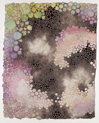
(watercolor, gouache and map fragments on abaca paper, 14×11)
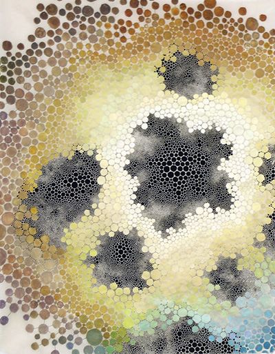
(watercolor and gouache on abaca paper, 14×11)
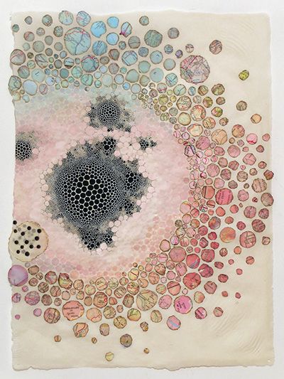
(watercolor, gouache and map fragments on abaca paper, 14×11)
As a child, Margolis used to stare at things until her vision swam with dots. She learned about molecules of liquids and solids in school, imagining them like the floaters in her eyes. At some point she found reassurance reading Leonardo da Vinci’s A Treatise on Painting, in which
he mentions that just by observing the stains on walls or the ashes of a fire, the artist is stimulated to new discoveries. Here was evidence that someone else—one of the greatest of the Old Masters, no less—liked to create from the miasma and minutia of experience. Eventually, she would find that imagination alone was not good enough, but that would be just one part of the slow construction of creative and intellectual components forming her compositional style.
She loved drawing faces as a child, and by the time she started speaking—somewhat later than other children—she was already carefully copying models from the photographs in Look magazine. Years later, when Margolis began studying portraiture at the Art Students League in New York City, she wouldn’t have guessed that she’d eventually enter a career in abstract art. She still loves traditional portraiture, but her creative trajectory took the direction of inner “portraits” of emotions.
Charting Emotions
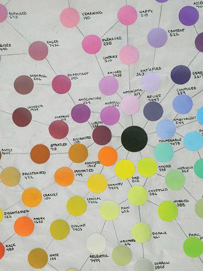
Flow Chart of Emotions IV is the latest iteration of Margolis’ color chart, used to standardize as well as encrypt her emotional experiences. Using a Pantone Color System, she assigns a reproducible color and identification code to each emotion—seen more clearly in the detail. When creating a painting, Margolis consults this chart, translating entries from her journals into encoded color
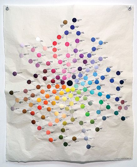
graphite, ink and Pantone color chips on abaca paper, 35×30
Painting the Unobservable
It was when Margolis took a microscopy course at John Jay College of Criminal Justice through the New York Microscopical Society that she developed her interest in micro- and macroscopic patterns. She got a good response from some initial work in creating visualizations of mental qualia (subjective mental experiences), for which she was able to use her knowledge of the behaviors of neurotransmitters as they respond to various chemical stimuli.
She enjoyed creating art based on things that can’t be seen—things that connected with her longstanding interest in emotions, personality disorders and the mind in general. She’d kept all her psychology books, returning regularly to Otto F. Kernberg’s Severe Personality Disorders: Psychotherapeutic Strategies. She’d also followed the changes to The Diagnostic and Statistical Manual of Mental Disorders by reading online. By 2011, she was creating a flowchart of major and minor emotions (see Charting Emotions, above). She found, however, that she wanted a more personal involvement. She’d always been an avid journal writer—that’s where she records her private thoughts, and although she didn’t want to share her entries, she realized that she had reams of resource material within those pages.
From Words to Colors
Margolis knew that she was interested in something beyond narrating events. The challenge was finding a way to paint what goes on “underneath.” She asked herself, What does a feeling look like? Her resulting mind maps chronicle interactions within the brain across various states of mental/emotional activity. Everyone has theirown vision of different feelings; Margolis’ self-appointed task was to create a personal, color-encrypted interpreta-tions of the flow of her own emotional experiences.
“The colors of the flow chart were worked out so that families and complexes of emotions could be included within a color scheme,” says Margolis. Since there are more varied negative emotions, she assigned blue and green schemes for the wide assortment of those feelings. Designating color families in this way allowed her to differentiate between negative, positive and neutral feelings while expressing the beauty of the emotional being in all its states.
Margolis used chips from a Pantone color system to create her flowchart, which is now in its fourth iteration. “Every time I added a new emotion,” says the artist, “I had to fit it into its color family. I typically wait to create a new chart until I have a number of new entries, but the original color assignments are fairly standard through all iterations.
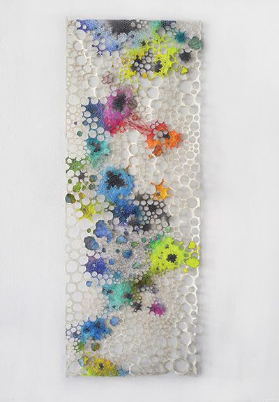
(watercolor, gouache and map fragments on abaca paper, 48×18)
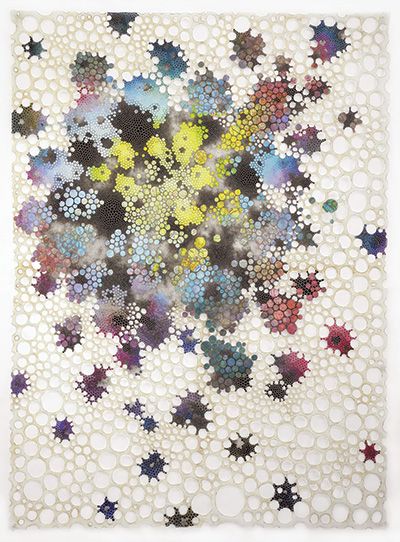
(watercolor, gouache and map fragments on abaca paper, 48×36)
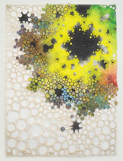
(watercolor, gouache and map fragments on paper, 24×18)
When creating a painting, Margolis starts with a central black nucleus. “This serves to activate my mental flow, in addition to being symbolic of the unconscious,” she says. “I work with the intricacies of my thoughts, feelings and memories, teasing out threads of personal meaning that I translate into patterns of colored particles and meticulously apply with a paintbrush.” She works on abaca paper (see On the Surface), wet-on-dry, so she can make color choices as she proceeds. For example, she may go from red to blue across the page and then, while in the process of painting, decide whether there will be a purple. “I do have to work one color into the next and so will con-sequently include ‘wayward’ colors,” she explains. She also points out the difficulty of reproducing Pantone colors.
“With errors in color mixing, my system is flawed,” says Margolis, “so the works ultimately are as much about inaccuracy and subjectivity as they are about my emotions.”
“I work with the intricacies of my thoughts, feelings and memories, teasing out threads of personal meaning that I translate into patterns of colored particles.”
Karen Margolis
The Zen Factor
As a regular practitioner of Zen meditation, Margolis finds that the act of painting often requires a similar mental discipline of acknowledging stray thoughts so that she can then let them go. “When I fall into a state of uncertainty, I create additional black nuclei until I gain access to my emotions,” she says. Thus, black is a design element that also recognizes the thought process of painting.
The black nuclei always appear as an underlayer—the black dots and white webbing showing in the spaces between the colored dots. These interstitial spaces challenge her to reflect on how to fit in another dot as if it were a puzzle piece—but one that must also suit the state of mind she’s presenting. Nevertheless, the size of the colored shape doesn’t necessarily indicate the extent of her feelings. Things aren’t so proportional. As an artist, she must remain engaged, allowing the painting to radiate, rather than forcing it into whatever thought initiated the practice.
Margolis takes much inspiration from the circle, which she describes as “the most basic component in existence, connecting the microscopic to the universe; it’s a molecule, a neurotransmitter and an enso—a sacred symbol in Zen Buddhism, embodying perfection and infinity. I’m attracted to its mystical elements as well as the paradox of imperfection.” One dot of color relates to the next one in her paintings, and she’s always trying—but never quite succeed-ing—to make a perfect circle. Under a magnifying glass, the dots are always a little oblong, a little irregular in their shapes.
On the Surface
In 2000, Margolis became a Workspace Program Resident at Dieu Donné, a nonprofit, based in the Brooklyn Navy Yard, that’s dedicated to retaining the use of handmade paper in contemporary art. While fulfilling her residency, she become enamored of abaca paper. “Abaca” is the term for hemp in the Philippines, where much of the fiber is harvested from the stalk of a particular kind of banana tree, Musa textilis. Its long fiber can be battered for up to eight hours, giving it a wet strength that allows artists to manipulate it easily. It has a high translucency but retains sufficient bite to make it satisfying for use with watercolor. Margolis regularly uses abaca paper for her paintings and has also used it for sculptures composed of paper, linen and wire.
Connecting the Dots
In 2010, Margolis’ painstaking practice led her to make actual holes in her paper surface, incorporating negative space, as seen in Elusive, Combustion and Pending, Anacoluthia and Anomie, all paintings in her Integration series. “In a struggle between destruction and creation,” Margolis explains, “my art-making involves two distinctly opposing procedures: burning holes in material as an act of elimination and then constructing discrete components into compositions.”
At one point, while working on a painting, the paper ripped, and in trying to repair the damage, she introduced thread and the concept of sewing paper, color and thoughts together. For Anacoluthia, Margolis created a densely explicit area of black threads; for Anomie the thread creates a light, more open webbing. The differing effects of the two works make evident the impact the humble threads can have.
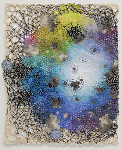
(watercolor, gouche, thread and map fragments on abaca paper, 14×11)
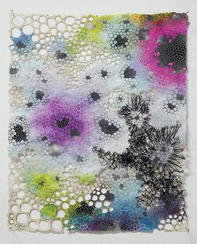
(watercolor, gouche, thread and map fragments on abaca paper, 14×11)
Making mind maps is an exercise in creating something new from some-thing of the past, in this case, states of mind. Building on this concept, Margolis often includes in her paintings a sprinkling of dot-shaped scraps from old road maps—fragments that become more apparent upon close examination of the works. “I want to believe the implicit promise of being able to find my way, as if a map can somehow show me the route of my life’s journey,” says Margolis. The artist knows, however that maps are never quite direct. It’s the space between one place and another that’s so interest-ing—and it’s in getting from one dot to the next that Margolis finds her art—and the art of living.
Meet the Artist
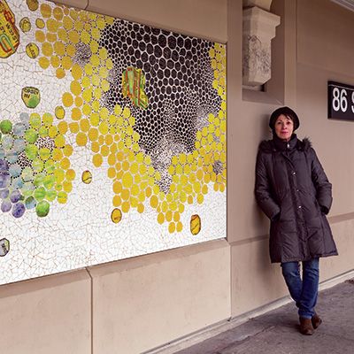
Karen Margolis received a B.S. in Psychology from Colorado State University. After moving to New York City, she continued her research in neuropsychology and took a class in microscopy at John Jay College of Criminal Justice. She also studied portraiture at the Art Student’s League and took classes at Parsons School of Design and the School of Visual Arts. Her award-winning art practice extends beyond painting to sculpture, set design and mosaic murals. In 2004, she produced a program for teaching art to blind and visually impaired teenagers at The Lighthouse International. In 2014, as a consultant for Art Beyond Sight, she worked with the New York City Mayor’s Office for People with Disabilities to organize events for the 25th Anniversary of the Americans with Disabilities Act.


